5 Pro Tips to Choose Home Colour Combinations like an Expert
1. Use the 60‑30‑10 Rule for Making a Perfect Home Colour Combination
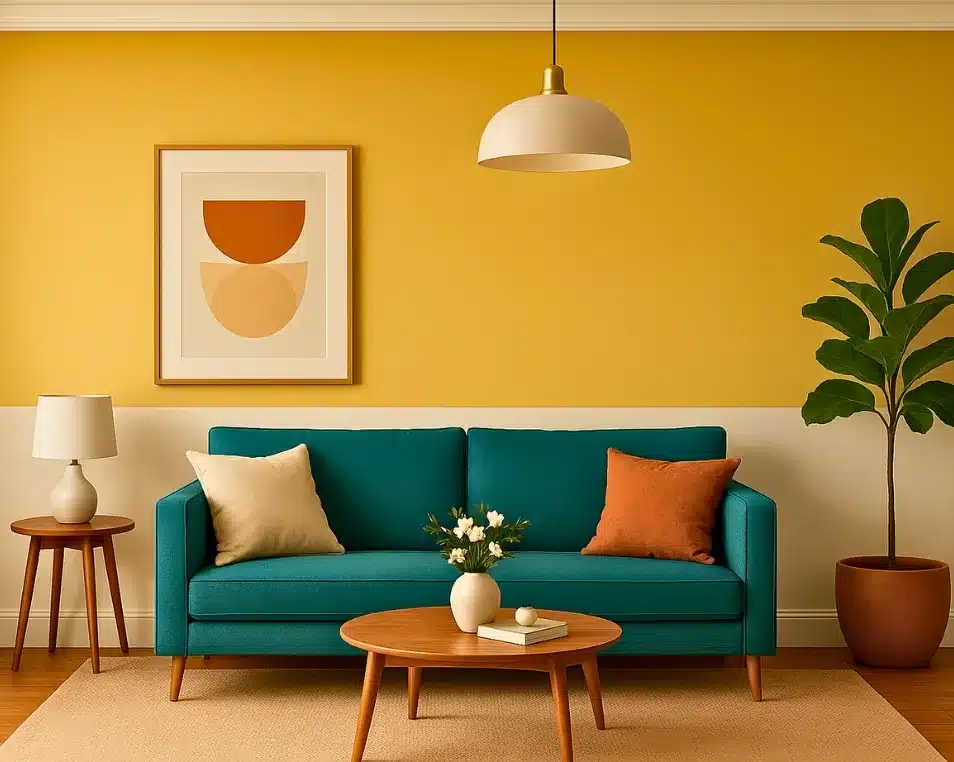
The 60-30-10 rule is a collective design approach that has evolved over a period of time through hands-on ground practices. According to this theory, the home colour combination must have a rule according to which colours should be given weightage- 60-70% to base colours, 30-40% to secondary colours and 10-20% to accent colours.
Reason: Avoids the random use of colours that pinch in the eyes.
2. Decide the baseline colour for your home interior
The baseline colour is the one main colour from the palette that needs to be present in the majority of the home, i.e., approximately 60-70% of the walls and large furnishings. This is the first thing you should do while choosing home colour combinations.
Reason: They reflect your personality and help in creating better personalised spaces.

3. Choose a Supporting ‘Secondary’ Colour
The secondary supporting colours must cover 30-40% of the space. They can be one or two tone, lighter or darker shades of the baseline colour. Use this colour in trims, accents, walls, featured textures, textiles, etc.
Reason: Similar tones of colour highlights bring smooth transitions that give a seamless yet zonalisation of tasks.
Also Read: Best Colour Combination for Bedroom Not Even on Pinterest
4. Add an accent shade for the home colour combination.
The accent shades are generally the highlight colours. They are used to add a little drama. Just as you like having a bit of tangy flavour in your cakes/ icecreams ( they cut down extra sweetness), the accent colours cut the monotone feeling around.
Reason: Add drama in small portions that visually balance in every space.
5. Neutral colour combinations for homes are perfect for base colours
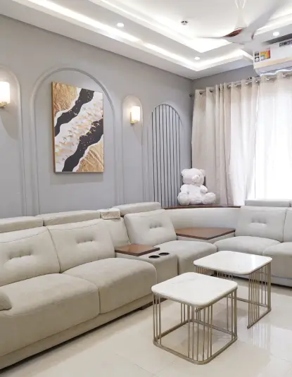
Soft shades like white, greys, beige, coral colours and more stand great for making the base of the house walls. They bring a sense of immersive design ideas.
Reason: Soft shades are not hard on the eyes and bring a smooth transition of areas. Secondly, this smooth transition helps in making
Societies We've Worked
6. Pick warm schemes for home colour combinations in 2025
Earthy tones like wood, rustic, taupe, sage green, etc, should be used as accent colours. These kinds of warm, earthly shades bring nature close to you and surround you with utmost comfort.
Reason: Earthy colour tones bring you warmth and a welcoming gesture in your home.
Visit our YouTube channel here for sample designs, or you can seek inspiration from our Pinterest design gallery.
A quick homework on colour psychology
- Blue/green: These are cool corals that are best used for bathrooms and study areas.
- Yellow/orange: These colours are driven by the sun and are symbols of energy. Must be used in pooja rooms, kitchens, etc.
- Grey/navy: They are the royal colours in the directory of home colour combinations. Use them either in big spaces, accent walls and places with ample natural light.
Bonus Tips on Home Colour Combination
- Create swatch boards: Paint small samples on poster board and view them together before committing.
- Use digital visualisers: You can use AI apps or simpy hire an interior designer for the same who could give you whole idea of home with previsualisation of designs.
- Test before full-commitment: Paint a test area and live with it for a few days—lighting and mood shift over time.
Some Examples for Home Colour Combination Palette in Action:
Living Room
- Dominant- Soft Griege
- Secondary- Dusty Blue
- Accent- Brass/ Gold
Kitchen Room
- Dominant- Warm White
- Secondary- Sage Green
- Accent- Matte Black
Bedroom
- Dominant- Pale Mint
- Secondary- Light Grey
- Accent- Mustard or Ochre


Brands We Use


